Strategic Colors That Convert Year-Round
The air is getting crisper, I’m reaching for my favorite burgundy sweater again, and I’m having thoughts about fall color palettes.
As someone who discovered I’m an Autumn color hue through working with my color-powered confidence coach (yes, that’s a real thing, and yes, it changed everything), I’ve become slightly obsessed with how strategic color choices affect everything from trust-building to conversion rates.
Here’s what’s fascinating: While analyzing dozens of creative business websites over the past few months, I noticed something unexpected. The most successful brands aren’t just throwing traditional fall colors at their websites and calling it a “refresh”. They’re creating sophisticated fall color palette for business systems that feel authentically autumnal but work strategically year-round.
And honestly? The difference in how these brands position themselves is night and day.
This isn’t about abandoning those cozy fall feelings we all love. It’s about creating a complete color story that feels seasonally authentic but strategically intentional, colors that work as hard as you do to attract the right clients and projects.
From “Pretty” to Profitable: Why Most Fall Color Choices Miss the Mark
Here’s the thing I keep seeing: Most creative businesses choose fall colors based on what looks pretty in the moment. There’s nothing wrong with pretty, (I love pretty!) but colors that convert aren’t always colors that just look good.
After spending way too many hours diving into luxury brand websites this season (research, I promise), I discovered something intriguing. The most sophisticated businesses aren’t just using traditional “fall colors.” They’re creating strategic bridges from familiar seasonal feelings to year-round brand assets.
What I found instead of the predictable orange-and-burgundy combination: A sophisticated 4-color system that signals premium positioning without coldness, forward-thinking approach while staying grounded, and approachable expertise that never feels intimidating.
Let me walk you through exactly what I discovered.
The Complete 4-Color Strategic System
1. Chocolate Brown – Your Foundation (60%)
What everyone else does: Sweet caramel, cozy warmth
What converts: Grounding luxury that replaces harsh black
I’ll be honest, when I first saw tech companies using brown for branding, I was skeptical. Brown for software? But here’s what I learned: Brown conveys the reliability clients desperately want from their service providers. It’s like the visual equivalent of that friend who always shows up when they say they will.
Where to use it: Navigation, headers, body text, primary branding elements
Why it works: Signals reliability and premium positioning without the coldness of black. It’s sophisticated enough for luxury brands, warm enough for creative businesses.
2. Mapped Blue – Your Innovation Signal (25%)
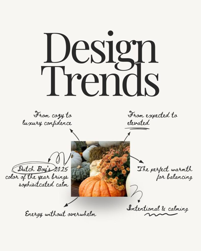
Plot twist: This is actually Dutch Boy’s 2025 Color of the Year, and I’m completely here for it.
They call it “mindful living energy,” and honestly, that’s exactly what it feels like. The yellow undertones create perfect harmony with warm autumn brand colors while signaling innovation and growth. It’s like if “I’ve got this handled” and “I’m always thinking ahead” had a color baby.
Where to use it: CTAs, interactive elements, secondary backgrounds, accent features
The psychology behind it: Specifically chosen for spaces that promote well-being, ideal for creative businesses wanting both stability and progress.
3. Fawn – Your Warm Connector (10%)
This is the color that makes everything else work together. It’s like the perfect neutral cashmere throw that somehow makes every other piece in your living room look more intentional.
Where to use it: Secondary text, neutral backgrounds, breathing room sections, subtle dividers
Why it matters: Creates approachable warmth, the visual equivalent of someone feeling immediately welcome in your brand space.
4. Pumpkin – Strategic Energy (5%)
Now, before you roll your eyes at “another orange accent,” hear me out. The magic is in the restraint. Maximum impact through minimal application.
Where to use it: Key accent elements, notifications, seasonal touches, important highlights
The psychology: Brings enthusiasm and genuine passion without creating visual chaos when used sparingly.
Fall Color Palette Implementation for Business Websites
How These Colors Work Together
When I see these colors working together on a website, here’s the unconscious client experience:
- Chocolate brown: “This person is trustworthy and established”
- Mapped Blue: “They’re forward-thinking and innovative”
- Fawn: “They’re approachable and warm”
- Pumpkin accents: “They have energy and genuine passion”
Combined brand message: “Strategic expertise with authentic warmth”, exactly where successful creative businesses position themselves.
Platform-Specific Applications (Because Consistency Matters)
Website Design (Following the 60/25/10/5 ratio):
- Headers and navigation: Chocolate brown
- Primary CTAs and links: Mapped Blue
- Background sections: Fawn
- Accent highlights: Pumpkin
Social Media Branding:
- Instagram: Fawn backgrounds with chocolate text, Mapped Blue story highlights
- LinkedIn: Chocolate-based graphics with strategic blue accents
- Pinterest: Full palette in seasonal mood boards
Business Materials:
- Email newsletters: Strategic pumpkin accents on key CTAs
- Business cards: Chocolate base with Mapped Blue contact details
- Presentations: Fawn backgrounds, chocolate text, blue section dividers
Why This Approach Actually Converts Better
Here’s what I’ve learned about client psychology: Most creative businesses struggle not because they lack talent, they simply haven’t made strategic color choices that position them professionally while staying true to their authentic style.
This fall website colors system provides:
- Year-round versatility for consistent brand building (no seasonal rebrand required)
- Professional positioning that attracts premium clients
- Seasonal relevance without limiting your brand to autumn only
- Complete color harmony instead of guessing what works together
Plus, there’s something deeply satisfying about having a color system that feels as thoughtfully curated as your favorite fall dinner party.
Your Implementation Strategy: Week by Week
Week 1: Foundation Setup
Start small. Replace black elements with chocolate brown in one key area, maybe your navigation or headers. Test Mapped Blue for your primary CTA button. Notice how the warmth immediately changes your brand feeling.
Week 2: Expand and Refine
Add fawn as breathing room in backgrounds or between sections. Introduce subtle pumpkin accents (remember: 5% maximum). Gather feedback from trusted colleagues or clients—you might be surprised by their responses.
Week 3: Full Integration
Apply the complete system across your website. Update social media templates with the new palette. Create simple brand guidelines for consistent future use.
Week 4: Optimize and Measure
Track engagement metrics on updated pages. Note client responses to the refreshed branding. Document what’s working best for future reference.
Frequently Asked Questions
How can I implement seasonal colors into my business branding? The most effective seasonal business colors balance warmth with professionalism. This chocolate brown, Mapped Blue, fawn, and strategic pumpkin system works because each color serves a specific psychological purpose while maintaining visual harmony.
What if my current brand colors are completely different? Start with one element, maybe your CTA buttons or accent colors. You don’t have to overhaul everything at once. Sometimes the best brand evolution happens gradually.
How do I know if these colors work for my specific business? Test them in small ways first. Change your email newsletter template or create a social media post using this palette. Pay attention to how it feels and how people respond.
Can I use fall colors year-round for my business? Absolutely. This system works year-round because it’s built on strategic color psychology rather than seasonal trends. The colors feel authentically fall while supporting professional positioning in any season.
How much of each color should I use? Follow the 60/25/10/5 ratio: 60% chocolate brown (foundation), 25% Mapped Blue (innovation), 10% fawn (connection), 5% pumpkin (energy). This creates visual hierarchy while preventing any single color from overwhelming your design.
What I’m Curious About
Which color in this system resonates most with where you want to take your brand this fall?
I’d love to hear your thoughts. Are you drawn to that sophisticated chocolate brown foundation? Excited about trying Mapped Blue for something that feels both calming and innovative? Or maybe you’re ready to experiment with strategic pumpkin accents?
If you’re working on a website refresh this season and want to explore how these colors might work for your specific brand, I’d love to hear about your project. Sometimes the best insights come from real conversations about real challenges.
Your next steps:
- Save color palettes and Images that speak to you.
- Choose one element to test with these colors this week.
- Notice the difference in how your brand feels and how people respond.
Need help implementing a complete brand refresh that goes beyond just colors? Our template customization and design process includes color strategy development, plus the templates and systems to make your new brand work acroxx every touchpoint.
This fall color palette for business gives you the foundation. Now it’s time to build something beautiful and strategic on top of it.
If this blog post inspires you, I would love to hear your thoughts. Join Kim on Instagram, @mayandjamesco.
Thanks for your support!
")
")
")

